
Finding a project again after more than ten years
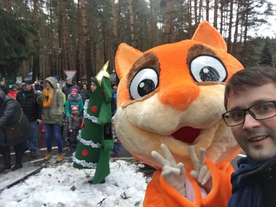
Recently, I returned to Yolochki Park in Domodedovo, Russia. I went to see my old friend Dima, who introduced me around 2015 to the client with whom this project began.
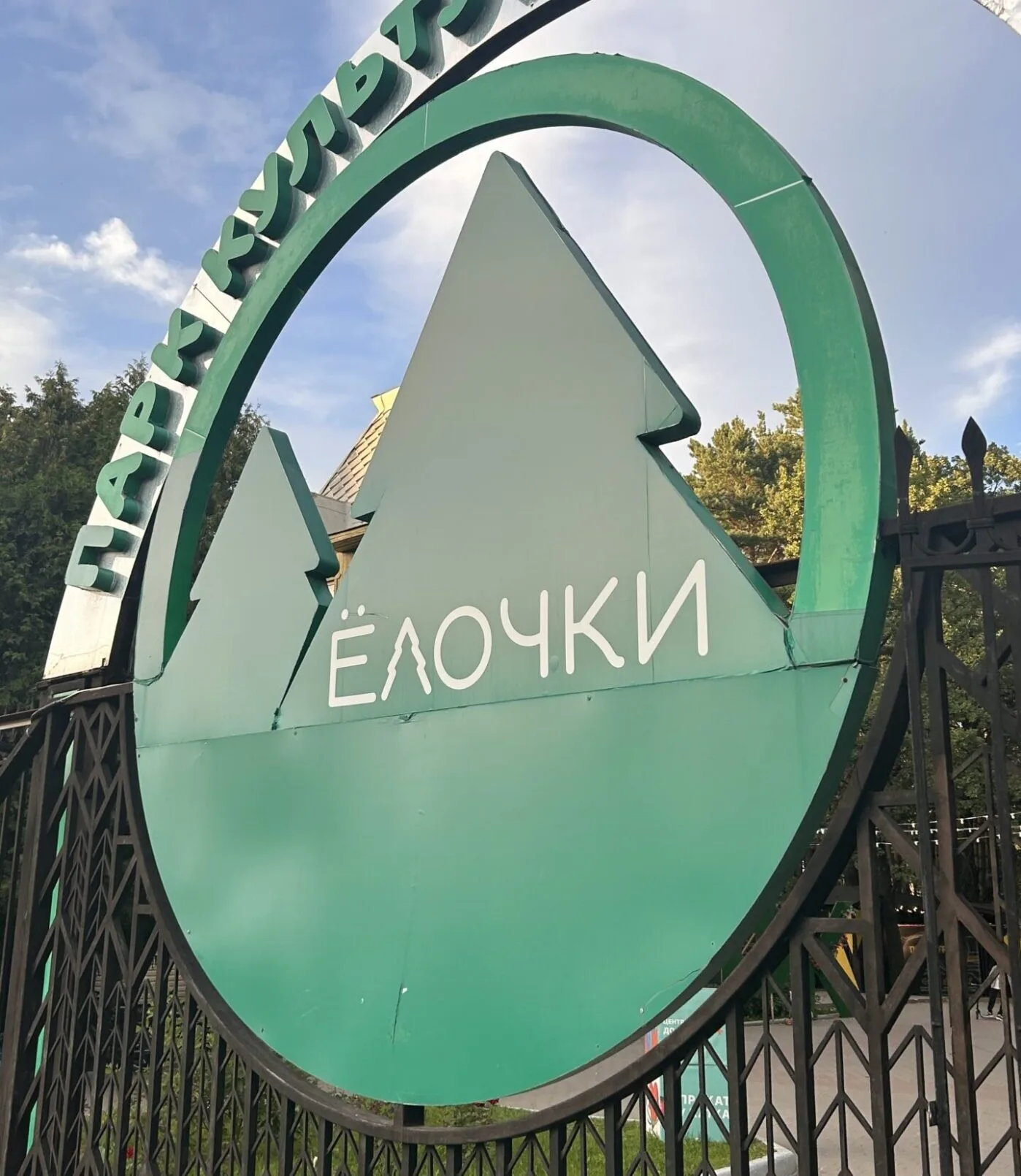
Among the pines, I found the logo we had designed more than ten years earlier. It is a strange and pleasant feeling: a decision that once lived on your screen is now part of a place's everyday life.
When a file becomes a real place
On a MacBook screen, a logo looks orderly and predictable. The designer controls the background, size, distance and surrounding elements.
In a park, things are different. The symbol becomes a large-scale structure, appears on signs, welcomes visitors and coexists with trees, architecture, notices and other messages.
At that point, the work belongs to the place. You are just passing through, checking that it still works without your intervention. There is pride, joy and gratitude—and, why not admit it, a small dose of satisfaction for the designer's ego.
How the Yolochki identity began
The 2015 task was straightforward: the previous image had become outdated, and the park needed a new logo and a refreshed identity.
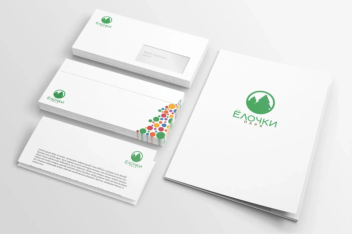
We wanted a simple, versatile and recognizable symbol. Around it, we developed characters related to the park's history, signage proposals and other elements. Later, some characters were produced as three-dimensional figures and used in the park.
The archived project, “Elochki Park ReBranding,” was published on December 12, 2015. At the time, it showed the delivered solution. Today, it is more interesting to observe what happened afterward.
What the symbol has lived through
Over the years, administrations, management structures, facilities and communication rules changed. The regional identity of the Parks of the Moscow Region also appeared.
Such transitions often bring changes in visual identity. A new administration may want to mark a new chapter, and the logo is one of the most visible candidates. At Yolochki, however, the symbol was retained.
It still appears throughout the park, guides visitors and coexists with the regional identity. That network's published guidelines allow its brand to be used together with each park's approved logo. At Yolochki, the combination feels natural.
The official Domodedovo parks website still presents Yolochki as an operating urban park. A Signify case study also documented the logo's use in a park lighting installation in 2017.
Visual similarity does not prove influence
Looking at the later regional identity, one can recognize related principles: circular composition, nature, a tree and simplified geometry.
I enjoy the thought that Yolochki might have been an existing visual reference in that environment. But I have no documents, testimony or contact with the designers proving direct influence. This is a professional observation about similarities, not a claim of authorship or causation.
Longevity alone does not prove good design
There is an important caveat: a logo can also remain through habit. Even a weak symbol can become recognizable if an audience sees it continually. Age does not settle the evaluation.
What interests me at Yolochki is something else: the symbol remains legible and recognizable, helps people find their way, works at different sizes and coexists with a newer visual structure. It does not need rescuing or rebuilding whenever a new application appears.
I am not in contact with the current administration and do not know why it chose to retain the logo. Perhaps it was practical; perhaps the symbol was already closely connected to the place. I can only speak about what is observable: it remains and continues to serve its purpose.
One of the best tests of the craft
Over time, you learn to look at your projects more calmly. The need to explain every line and defend every decision fades. The test of reality remains.
More than ten years have passed. The park has changed. Its visual surroundings have changed too. Yet the logo retains its integrity and its place among the pines.
Finding work you have let go of and seeing it live a life of its own is one of the best moments in this profession. It is the kind of identity I want to develop: one that can survive years, changes in leadership and new rules while continuing to serve.
The reflection also applies to a Latin American company. Before replacing a familiar symbol, examine what it has accumulated: recognition, a connection with a place and audience habits. Sometimes that equity is one of the brand's most valuable assets.
If you are considering a change, read when a rebrand makes sense and talk with us about what to preserve and what needs to evolve.
Sources and scope
This account adapts the original article by Denis Espinoza. It brings together references to the project archive, regional guidelines, the park and the lighting application. It describes the designer's observations; it is not a measurement of sales, economic impact or brand recognition.