


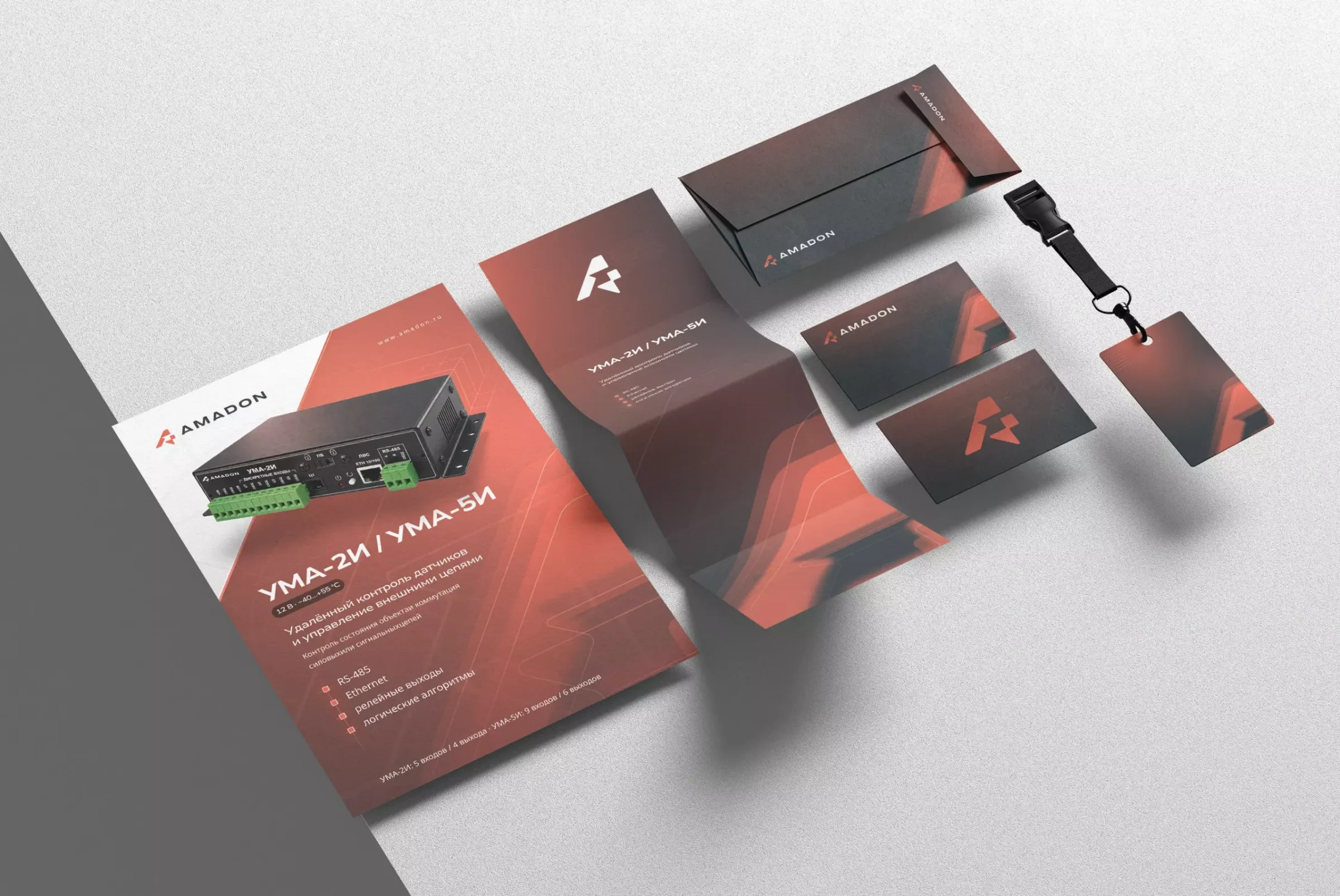
When a business enters a new stage, its identity may need a different role
Amadon designs and manufactures cabinets and climate-protective enclosures for electronic equipment. Some buyers look for a specific product. Others—engineers and technical specialists—quickly compare specifications, construction and suitability for the installation site.
The previous logo, written in Cyrillic, belonged to an earlier stage of the company. The new identity needed to express the expertise, precision and reliability of an industrial business more accurately. Not just in the symbol, but also in documents, interfaces and physical products.
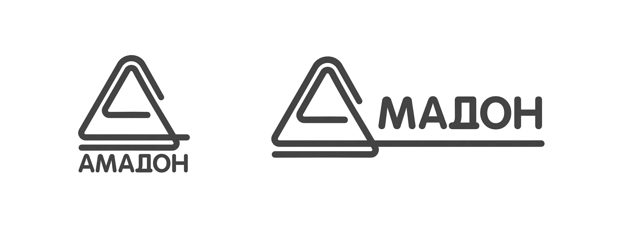
A rebrand should not start with “we are tired of the logo.” Identify what has changed in the business and what it needs to communicate today.
A concrete image helped define the brand's character
The project began with a forty-minute conversation with Amadon's director. Rather than stopping at broad adjectives such as “modern” or “technological,” a working reference emerged: someone who solves problems with their hands, thinks systematically and acts with confidence.
That image of a capable engineer helped compare two directions:
- Decorative technology: elements that could age quickly without conveying the character of a real engineering company.
- A well-organized engineering system: rigorous geometry, clear rhythm and few unnecessary gestures as practical decision criteria.
The value was not in depicting a person inside the logo. It was in turning an understandable description into a coherent visual direction.
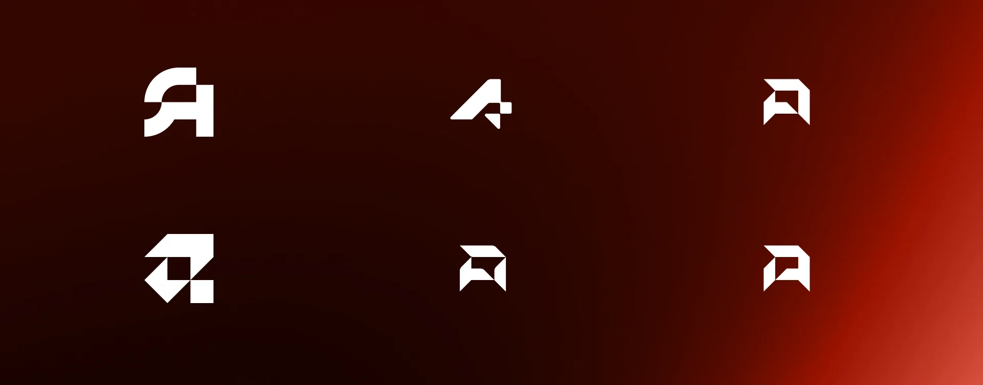
The new symbol is part of a structure
The selected symbol is built around the letter A. A diagonal introduces movement; angular elements suggest a base, a joint or a technical module. After selecting the concept, three iterations refined the proportions and performance at different scales.
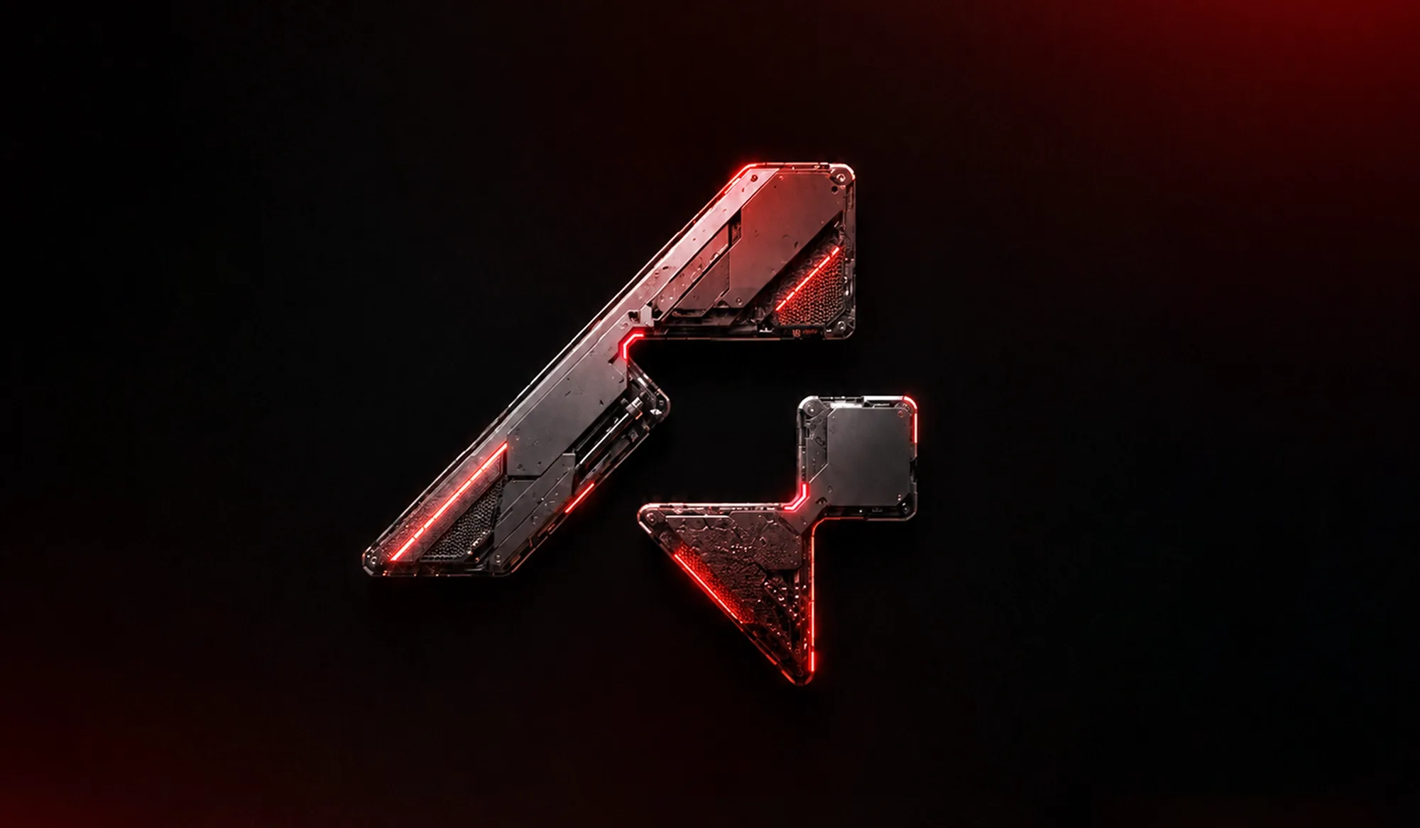
The identity combines four components:
- Logo: primary, vertical and standalone symbol versions.
- Color: a dark neutral, a red accent and white.
- Typography: Nunito Sans for a clear technical hierarchy.
- Applications: documents, interfaces, video and physical products.
Four checks before deciding on a rebrand
- Has the business changed? Check whether products, scale, market, processes or project complexity differ from when the identity was created.
- Who does it need to convince today? Identify the signals that help today's buyers trust the company, beyond internal preferences.
- Where does the symbol actually work? Test it on websites, documents, interfaces, packaging, parts, signage or product marking, as appropriate.
- Can the company implement the system? Confirm resources to update the main touchpoints, not simply receive a new file.
These questions can also lead to a less radical decision: keep the brand and improve its applications. Rebranding is not automatically the best response to every visual problem.
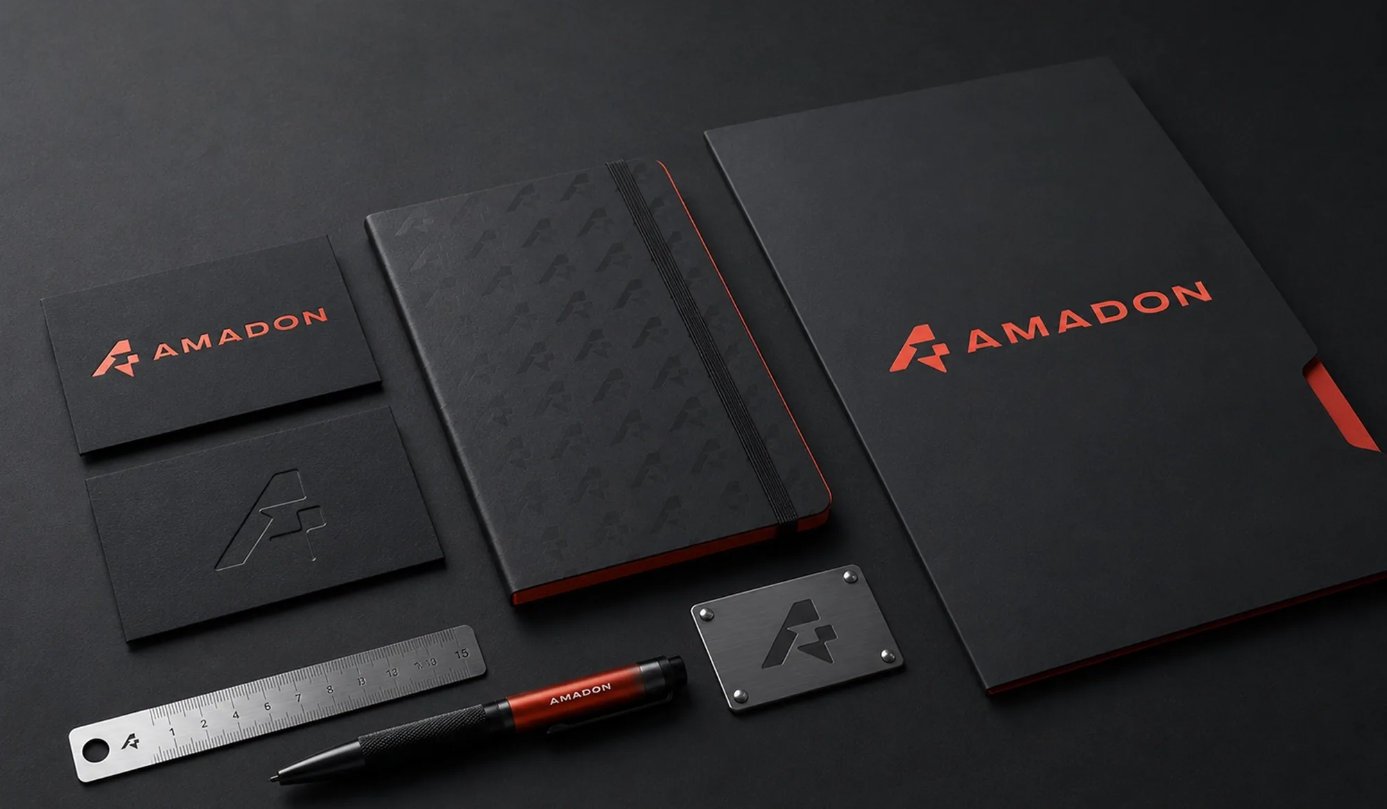
An approved identity being implemented gradually
The Brand Identity Guidelines documented logo versions, colors, typography, clear space, composition and iconography. The symbol was tested on aluminum parts and enclosures. The identity is used in brochures, presentations, videos, corporate materials and the website redesign.
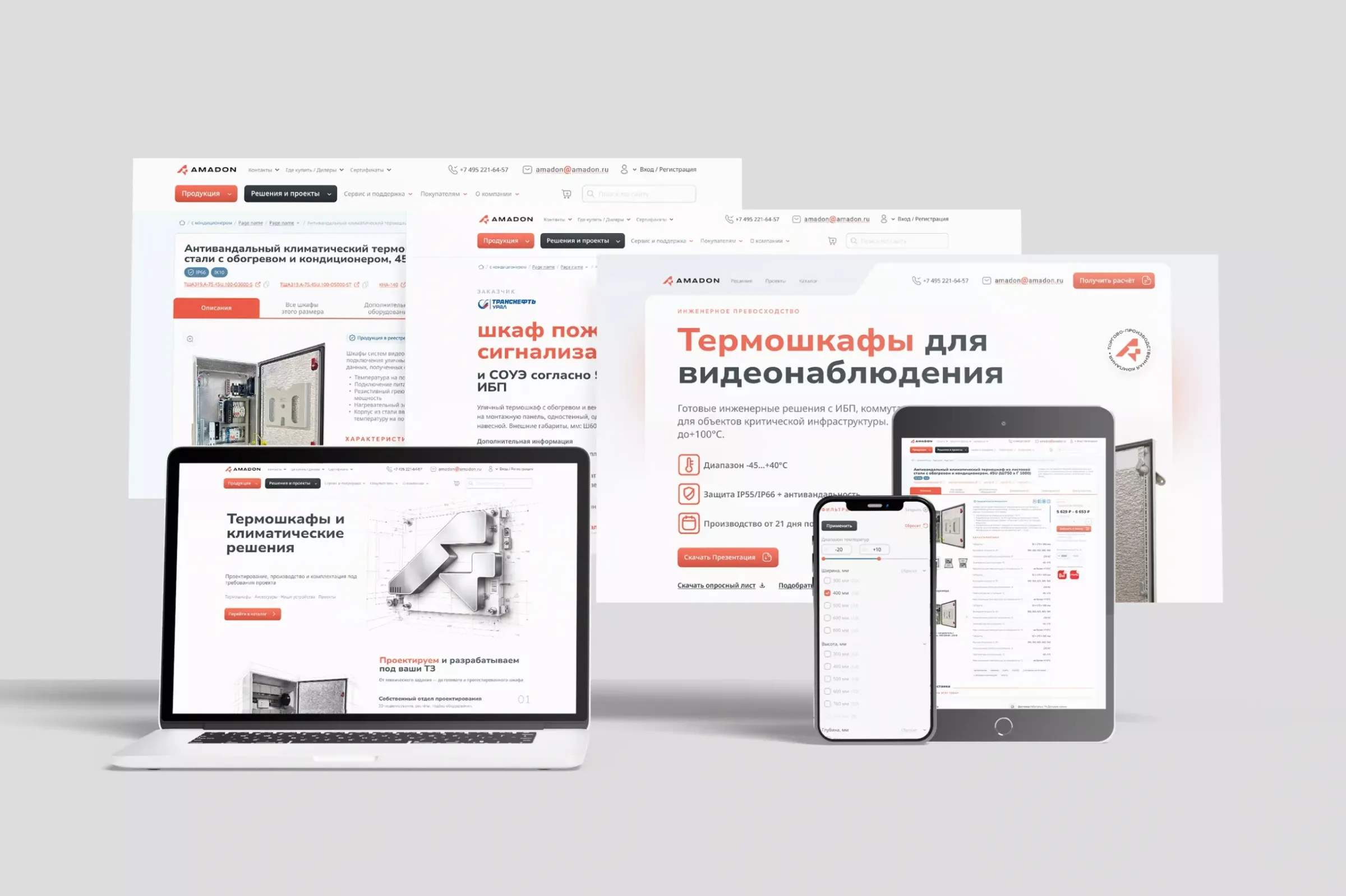
Limits of the result: approval of the system, physical testing and an ongoing rollout are documented. We do not have measurements that would support claims of increased sales, conversions or recognition.
For a company in Mexico, Peru or another market, the useful question is the same: does the identity still support the business as it exists today? The answer needs context, not change for the sake of fashion.
See the full Amadon case study. If you are considering renewing your brand, we can review the context with you before defining the scope.
Adapted from the original article by Denis Espinoza.